Continued Learning
Finding growth opportunities after joining the workforce!
-
My Role
UX Designer & Project Manager
-
The Team
Tiffany Apostolou | Shayna Abramson | Rachel Blatz | Jordan Chan
-
Tools
Photoshop, Figma, FigJam, Miro, Google Forms, Google Drive

Overview
The Scope
Our team set out to explore the field of continued education and focused specifically on the workplace as an area of interest. In doing so, we focused on the continued development of soft and hard skills observing the working professional holistically with personal and professional aspirations.
The Problem Space
We noticed that there are often difficulties looking for, narrowing down, and pursuing personal and technical growth after joining the workforce. There appears to be a lack of a streamlined, straightforward way to go about sourcing growth workshops for either soft or hard skills within the context of a workplace or team.
So we assumed that
A loss of balance in the workplace leaves professionals burnt out, and in need of mindfulness and intentional breaks.
Professionals would like consolidated learning opportunities of soft and hard skills geared towards advancing in the workplace.
Companies are searching for ways to implement programs in order to keep their staff happy and well while maintaining high retention rates.
The Goal
Our first goal was to research the space that we are working in and to understand what our users are struggling with to seek and ideate solutions that would best suit their needs.
As you will see, further below, we produced W.E.B, the Workplace Education Bazaar, a consolidated educational marketplace. We did so after extensive research & product testing that will be analyzed immediately below. It began by defining our initial problem statement…
So, we, initially, asked ourselves:
How might we help companies and individuals find opportunities for continued learning of soft and technical skills through the workplace?

Research
The Market
To better understand the existing market space in which we were considering inserting this product we conducted market research. After observing websites, platforms, apps, and companies that offer workshops and consulting for individuals as well as workplaces in whole including Thrive Global, Lynda Learning, Skillshare, we found that:
Users
To further understand matters from the viewpoint of users we created a survey that we sent out to source professionals who seek or have sought personal and technical growth after joining the workplace. We called 5 of those individuals, each from a different industry, to interview them focusing mostly on:
Their experiences sourcing and participating in workshops
Their understanding of mindfulness in the workplace
Their in-office experiences of skill-growth resource access (if any)
What we found
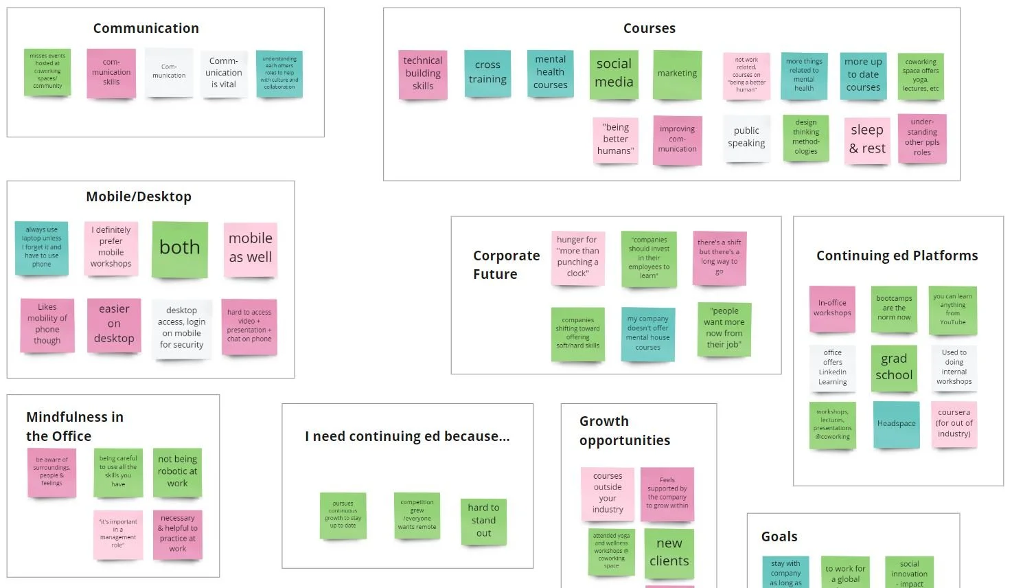
In observing common themes that were occurring amongst the responses we were getting from our users, we noticed that:
Time was a crucial factor in attempts to implement growth workshops for their workers, alongside Upper Management and HR approvals.
There is a growing need for both soft and hard skill development in the workplace, but many managers still remain hesitant to implement them, especially in more traditional industries.
Managers who do implement workshops for their teams find them to result in productivity and collaboration growth, and overall happier more deeply bonded workers.
Efficient communication, especially cross-departmentally, and creating an understanding of the value of work produced by different teams is vital for the betterment of the office experience.
It was managers who were primarily responsible for negotiating, implementing & hosting workshops in the office.
Defining our Core User
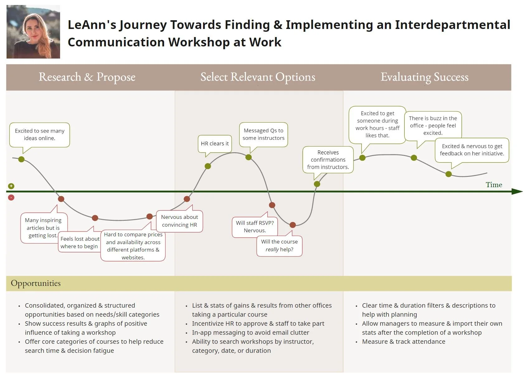
Through the interview process, our team was able to clearly visualize the central representative of our target audience, LeAnn!
LeAnn’s characteristics were drawn directly from our user interviews.
LeAnn's journey map, with the red points being low emotional points in her journey.To understand her even further, we put ourselves in her shoes and walked through her journey of finding a workshop, convincing HR, and booking it for her office. We did so through a journey map, the low points of which emphasized a need for a consolidated platform, for simpler category organization, flexibility between online/offline and mobile/web, and a need to alleviate email clutter.
What we found
All the research mentioned above confirmed our initial hypothesis and assumptions and it led us to refine our initial problem statement as we realized that it is primarily managers and office coordinators who facilitate workshops in the workplace.
So this time we asked ourselves:
How might we enable managers to source the most relevant and reputable workshops for personal and professional development in the workplace?

Design: Phase I
Prioritizing Features
Before taking to pen and paper, our team sat together to brainstorm features and prioritize them based on our timeline, and decide what was absolutely needed in this first iteration of our product. We created a MoSCoW Map and a Feature Prioritization Matrix that helped us conclude that we needed to prioritize:
Offering all content organized and manageable
3 basic course categories and their content
Ensuring Communication is a core category
Consolidating planning efforts (in-platform messaging, account/login, search)
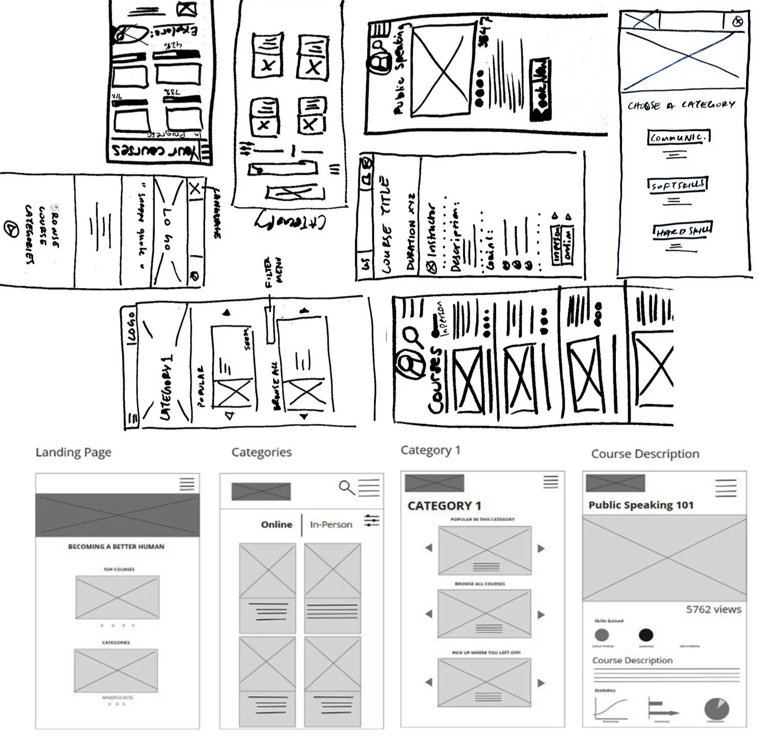
Design Studio
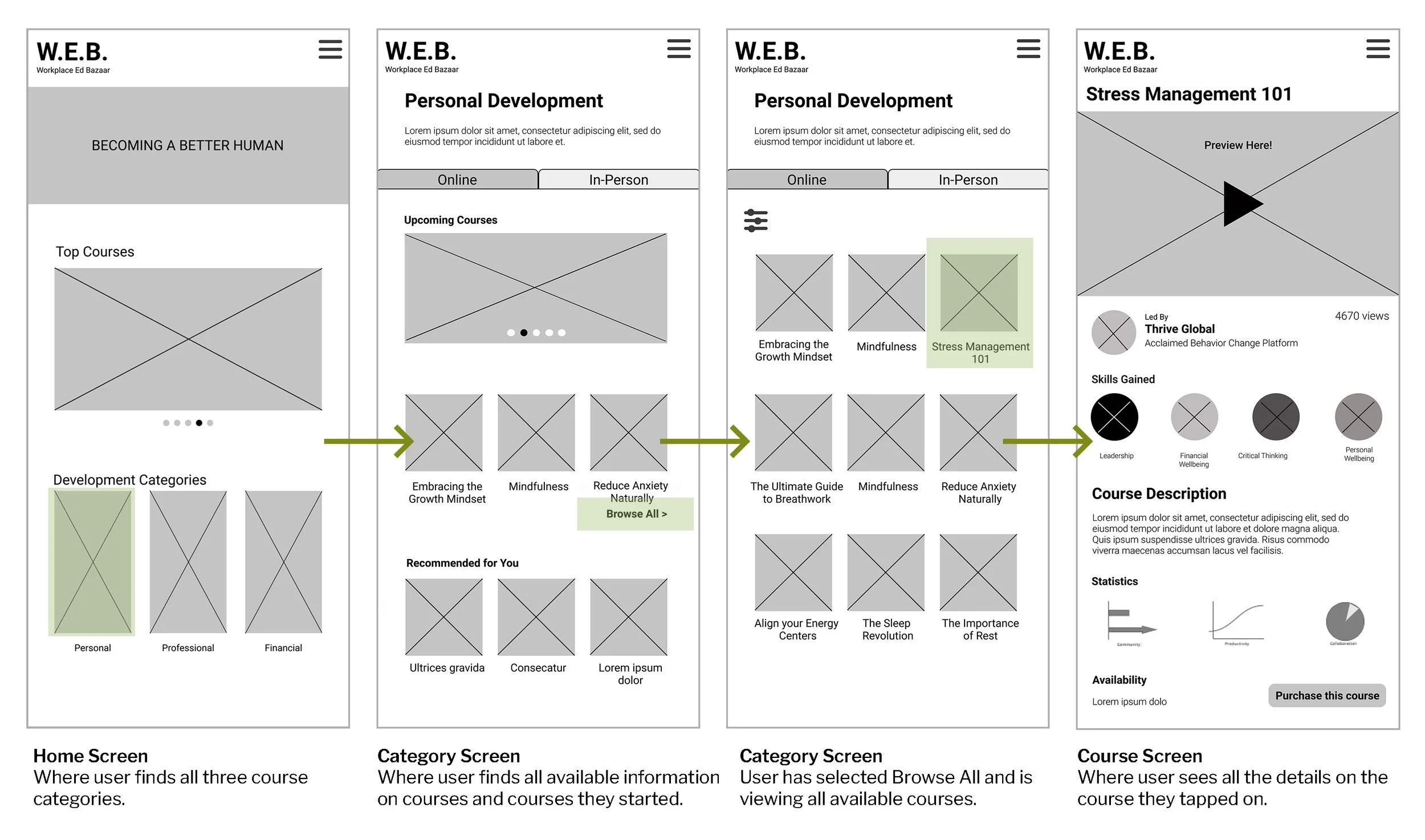
Having a clearer idea of what we felt was imperative for our product to offer, and what we would like for it to offer in this first phase of the project, we set out to have a Design Studio. The Design Studio rounds led us to a first low fidelity prototype/design which we leveraged to create mid-fidelity prototypes that we used to test on users to evaluate usability. In summation our mid-fidelity product would offer:
Courses
Navigational elements
Search filters
Ability to open and maintain an account
Mid-Fidelity Design
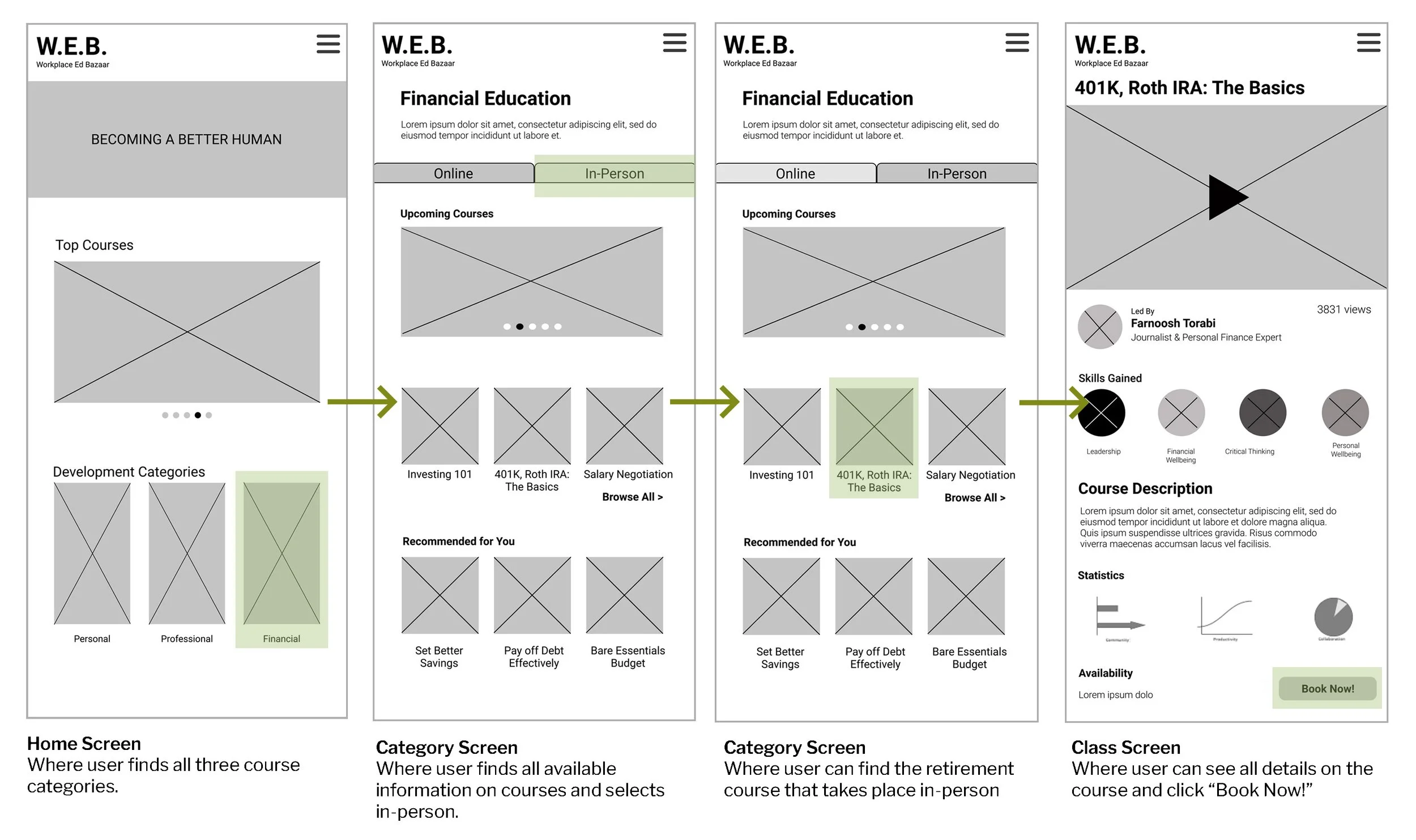
We then turned our low-fidelity design into a mid-fidelity working prototype in order to test it on users and make sure we were on the right track in what we were designing, and how we could improve it before moving into high-fidelity designs.
To make this easier for ourselves, we defined three core tasks that users should be able to accomplish in this first iteration of our product in more detail than what we did during design studio. This helped us gauge the most important screens that would be important to design, and we set three tasks, designed based on those, in order to test each one on individuals.
Testing the Product
From the feedback, behaviors, and stats we took from each of the 5 individuals we tested the mid-fidelity design on we found that in moving forward we need to:
Clarify the hierarchy in our design & the sizing of each element within the three category screens
Reduce information load on the Home Page to improve navigability
Use image & color to create a clearer distinction between categories and workshop types
Revisit titles of 101 courses, particularly in the soft skills categories to avoid confusion & overlap

Design: Phase II
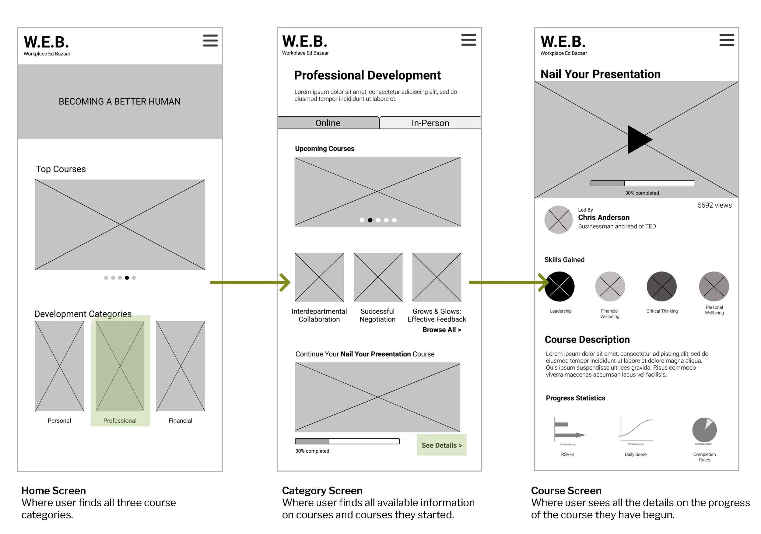
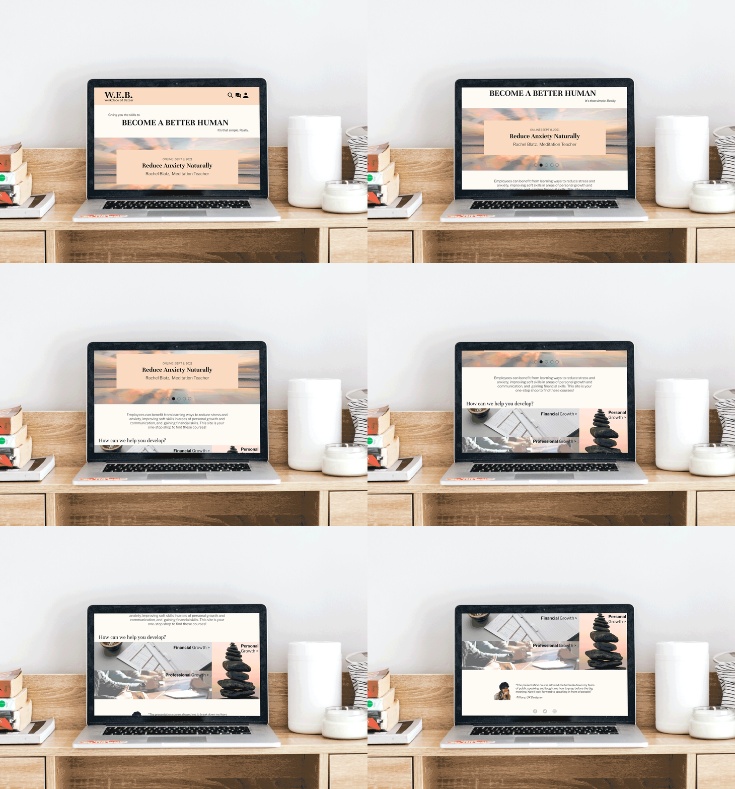
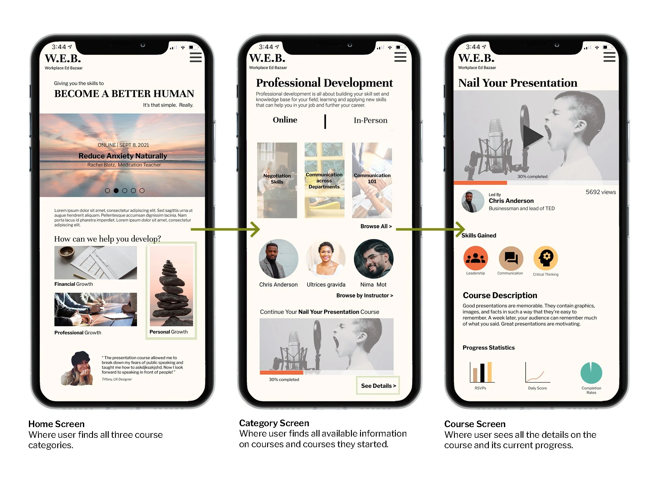
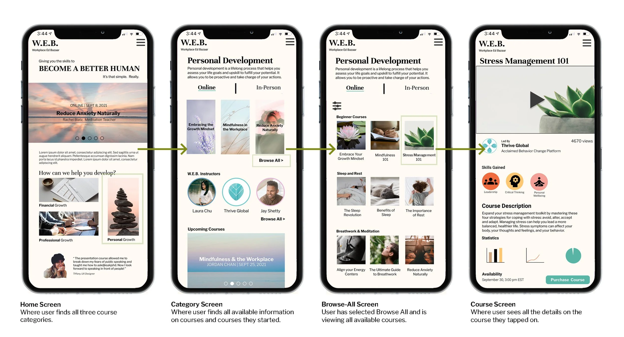
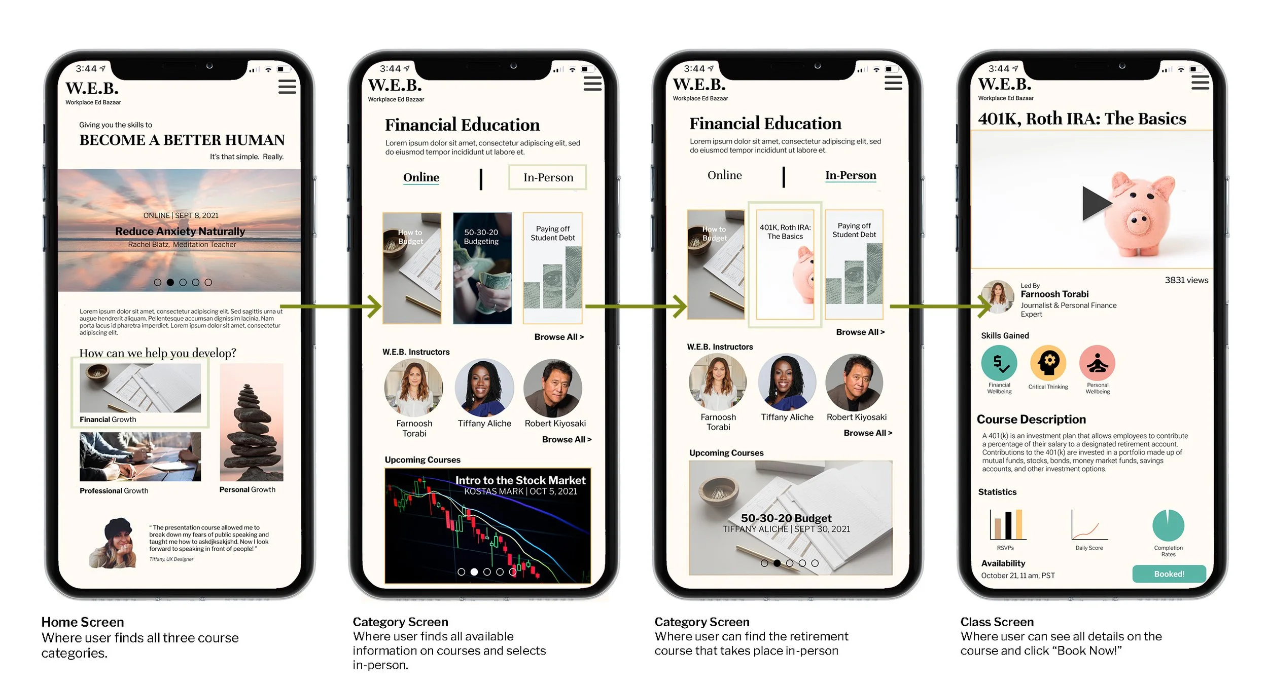
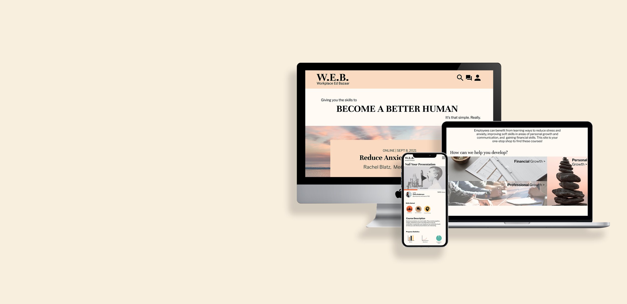
Taking into account both our overall research, as well as our findings from our first round of usability testing, our team set out to redesign the product, this time creating a high-fidelity iteration. In addition, our research showed that people used both mobile and desktop websites when searching, booking, and even attending workshops for personal or professional development. We decided as a team to create an adjustable design that would be accessible on both mobile and desktop devices.
Mobile Prototype Link
Desktop Prototype Link
Testing Again
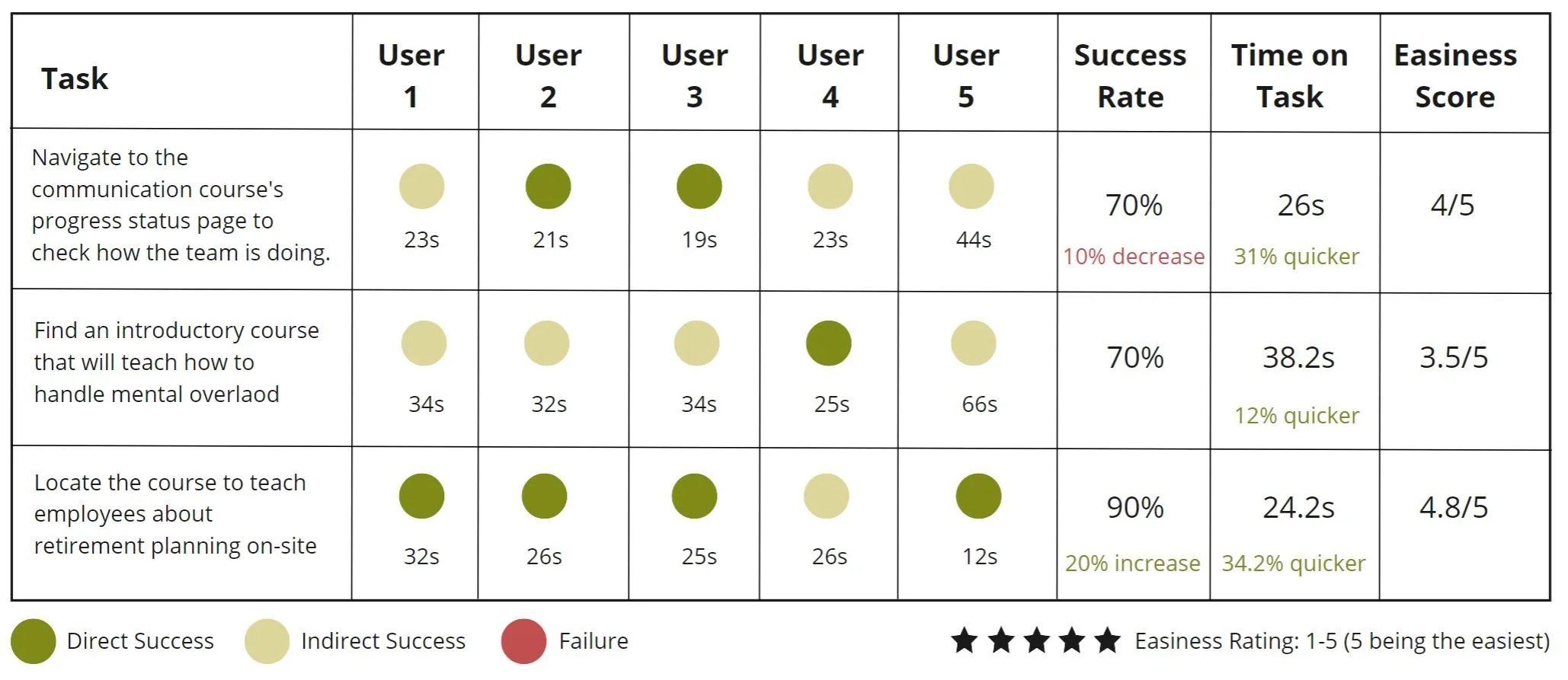
We took to a second round of user testing on another 5 people to see if there was an improvement in usability and any further insight on how to improve our product in the next iterations. We used the same tasks as the first round of usability testing.
We took note, again, of behaviours, time-on-task, and direct feedback from the people we tested and we noticed:
An increase in direct success rates in 2 of 3 tasks
A decrease in time-on-task in all 3 tasks
An increase in easiness rating overall
And that users attempted to access their account when trying to monitor progress

Next Steps
In taking note of feedback, behavior, and stats from our second round of usability testing, our team deduced that some immediate helpful next steps in moving this project along would be:
UX Writing: Ensuring that tasks and course titles are clearer so the user doesn't get stuck on a single page.
Developing the account button and menu:
Add "Progress Status" within the user's account to offer another access option
Develop the in-app messaging feature
Design the account page
Additional Tests:
Usability testing new features, and
Tree testing and card sorting to ensure the Information Architecture is helpful and intuitive to use

