The Road to Environmental Action
Giving People the GreenLight to Activism
-
My Role
UX Designer & Project Manager
-
The Team
Tiffany Apostolou | Clara Doley | Ayah Arwani
-
The Tools
Miro, Figma, FigJam, Zoom, Zeplin, Photoshop

Overview
Overall
Our team set out to investigate the space of environmental action and the challenges that people who want to actively participate face. Our first goal was to research the space and to understand what our users are struggling with to seek and ideate solutions that would best suit their needs.
Resulting of this entire process, as you will see below is a minimum viable product called GreenLight that aims to consolidate action opportunities alongside key tutorials on environmental and legal terminology that we found hindered people's decisions to take action. Read below for a walkthrough of our process to date.
The Problem Space
Although individuals are often interested in aiding environmental causes, they experience barriers in access to potential opportunities like volunteering or petitioning government representatives. Citizens looking to create a path towards outreach experience difficulties in navigating existing governmental structures and websites. Furthermore, people are often not aware of the scope of volunteer opportunities available or where to find them locally. And we assumed that:
There are many types of actions to take through policy locally, state-wide, or nationally that many aren’t informed of.
Individuals get overwhelmed by the dearth of available options, research demands, and disparity of available options.
People may not be aware of the full scope of ways to aid in environmental causes, beyond monetary donations.
To clarify and draw in on the leading challenge people are experiencing we asked ourselves…
How can we make local and national environmental initiatives accessible to the general public and anyone who would like to actively participate?

Research
Our Users
We interviewed 8 individuals that spanned an array of interests, professions, backgrounds, and ages. We discussed the causes they care about, their experiences searching for opportunities to actively contribute, high and low points of their experiences, and in cases where the action was not taken, we dug deeper to understand what might have hindered them.
What we found was that not only were our initial estimates correct but also that people were more likely to participate in an action:
Through our interviews, we were also able to personify our median user. Our team was able to calculate a representative median age, background, and lifestyle, that gave us Brooklyn! Brooklyn embodies the characteristics, goals, and needs of individuals we interviewed, and the users we were aiming to cater to.
The Market Space
Before moving forward, however, our team researched the market we intended to insert ourselves within. We noticed there was no consolidated platform or website where individuals could find opportunities for action, while specialized vocabulary often hindered them from looking further, or contacting representatives. So we began mapping out the features and offerings of organization websites, as well as some social platforms our interviewees had mentioned.
We arrived at the conclusion that:
Organization websites often offer limited/no filtering systems.
They often do not list collaborators they work with like scientists, groups, and tribes.
Users have a plethora of different sources to sift through.
Donating is the most clearly communicated, and easily found method of participation.
Social media platforms also require copious sorting & rely on following external links.
What is more, all of this research helped our team reach 4 insights that can lead us towards effective design action and enter the next stage in our UX process!

Design - Phase I
Discussing Features & APIs
The first thing we did once we clarified the four key steps we could take was to brainstorm, select, and prioritize key features for our product based on our research findings and our persona Brooklyn’s needs including:
Access to opportunities for action & instructionals
Time, Place, Category filters
News section to update users on results of their actions
Direct contact information
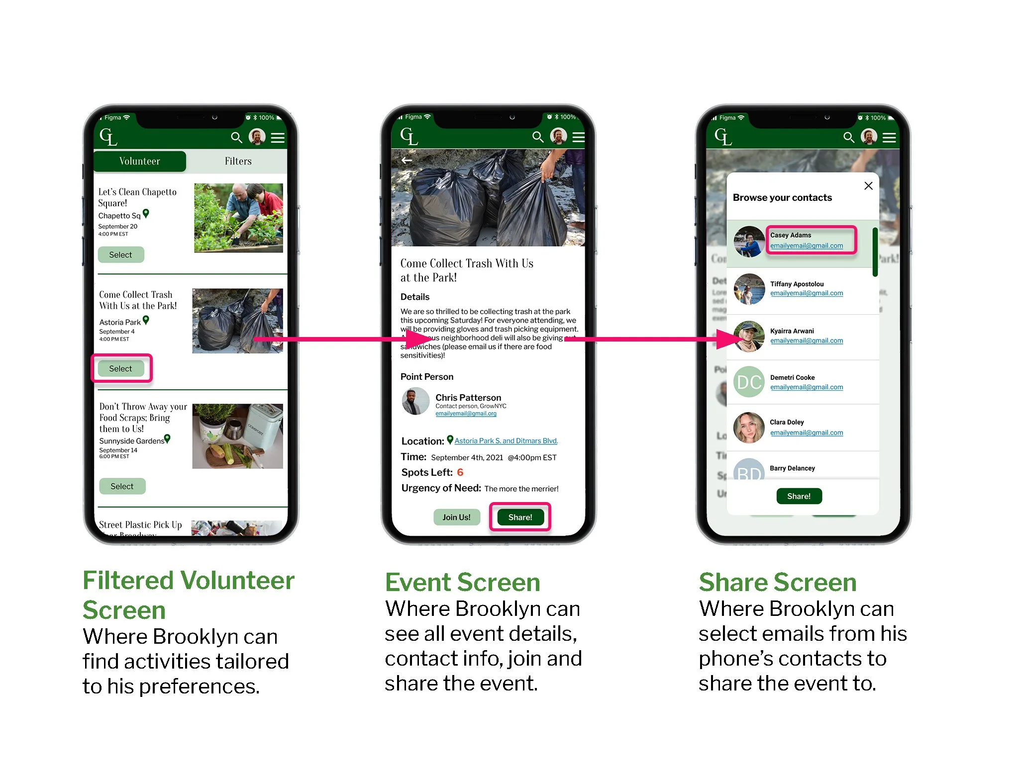
Ability to share events, and participation stats with contacts
Additionally, we considered APIs that we could possibly use to help our users even further including Access Phone Contacts, Google Maps, and a Search Bar.
Design Studio
From there we took to pen and paper and conducted a Design Studio. This is how our team brainstormed our first screens, and feature integration, and were able to combine the best ideas of everyone to formulate the idea of a working project. Our final collaborative sketch was also drawn out with the intention of allowing our users to find consolidated and organized action opportunities as well as informational content.
Mid-Fidelity Designing & Testing
We then turned our low-fidelity design into a mid-fidelity design with a working prototype in order to test it on users and make sure we were on the right track, and how we could improve things before moving any further ahead.
To make sure we were designing what our users needed, we created a mid-fidelity product that would help our users complete 4 tasks successfully. In this way, we were also able to test these tasks on individuals to see what was working and what needed some tweaking and how, before moving forward.
Testing Results
From the feedback, behaviors, and stats we took notes on, from each of the 6 individuals we tested the mid-fidelity design on, we found that in moving forward we need to:
Move the filter selections in a secondary nav within the action pages
Improve the accessibility to filter options
Change military time to AM/PM options per user feedback
Relocate all buttons on the home screen to the right to improve access
Separate the tutorial articles between environmental and whatever pertains to policy (local or national)
In response to the confusion on what the category “Speak Up” referred to, the team considered adding categories within “Speak Up":” Demonstrations, Contacting Representatives, Policy Hearings & Report/Town Hall Meetings

Design - Phase II
Designing in High Fidelity
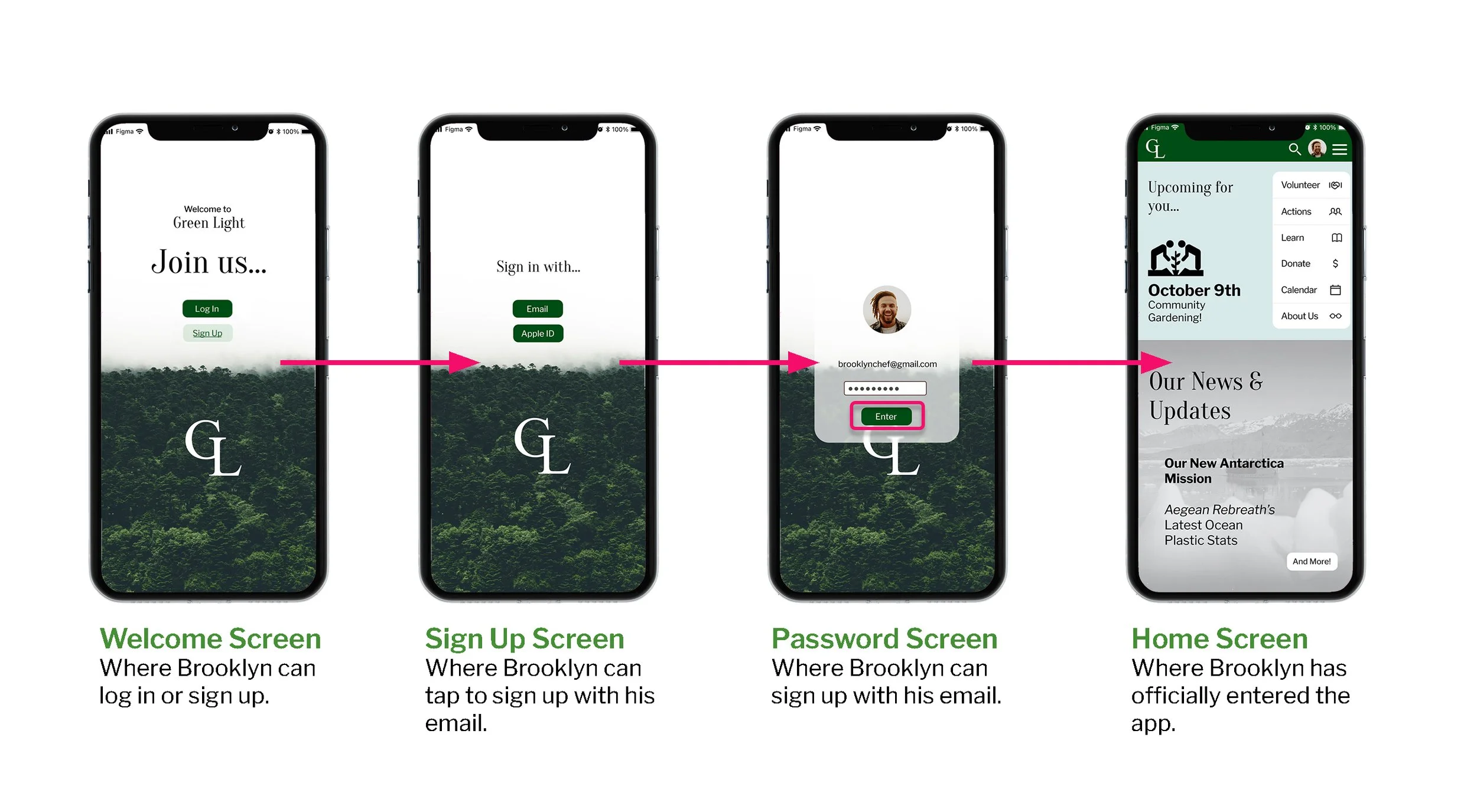
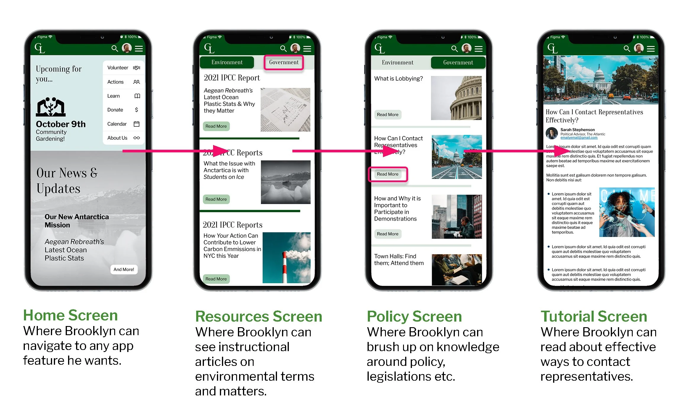
After the first round of tests, we used our notes, observations, and feedback from people we tested to inform our design and move into high-fidelity designing that we also tested in order to confirm usability, as well as see where there is still room for improvement. We tested by designing 4 key tasks that users had to complete by using our product.
View our mobile prototype, and…
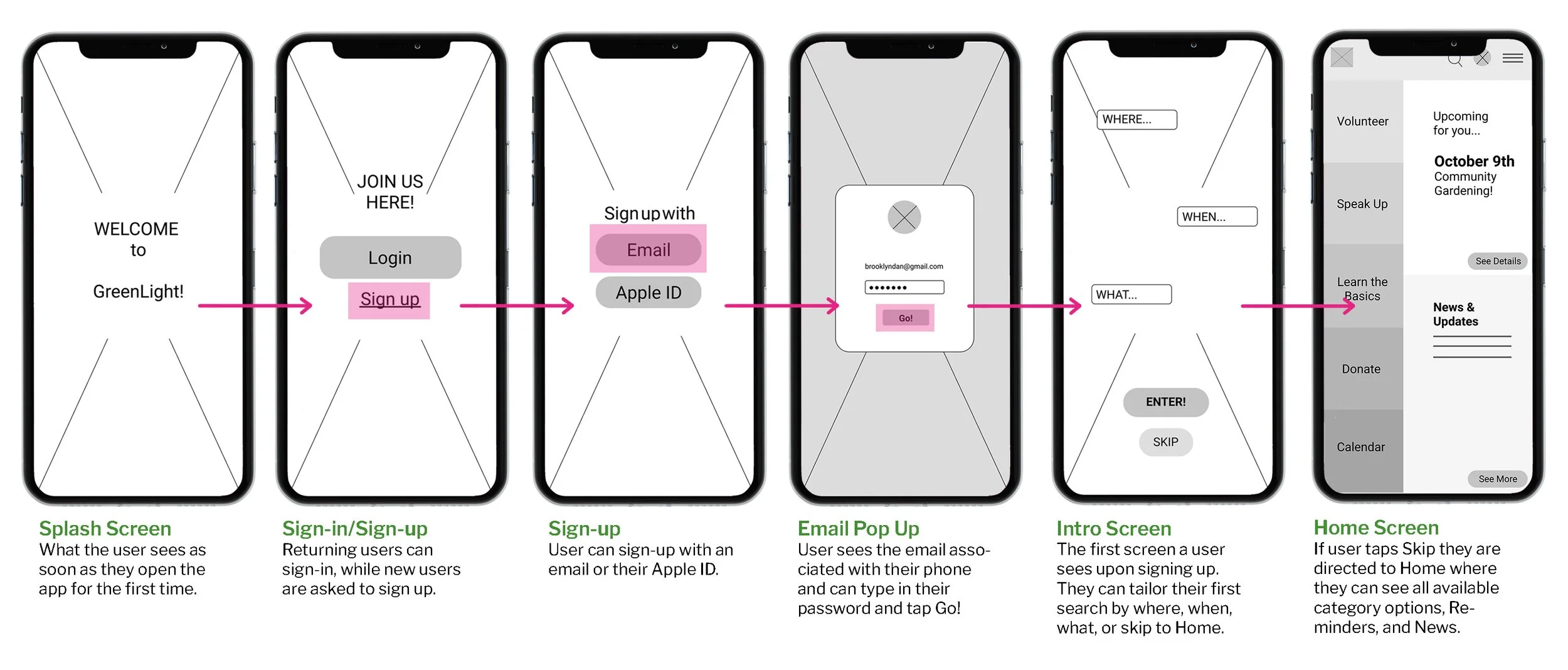
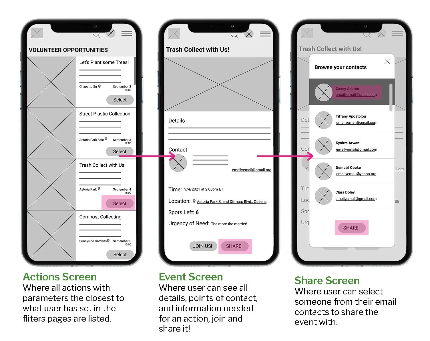
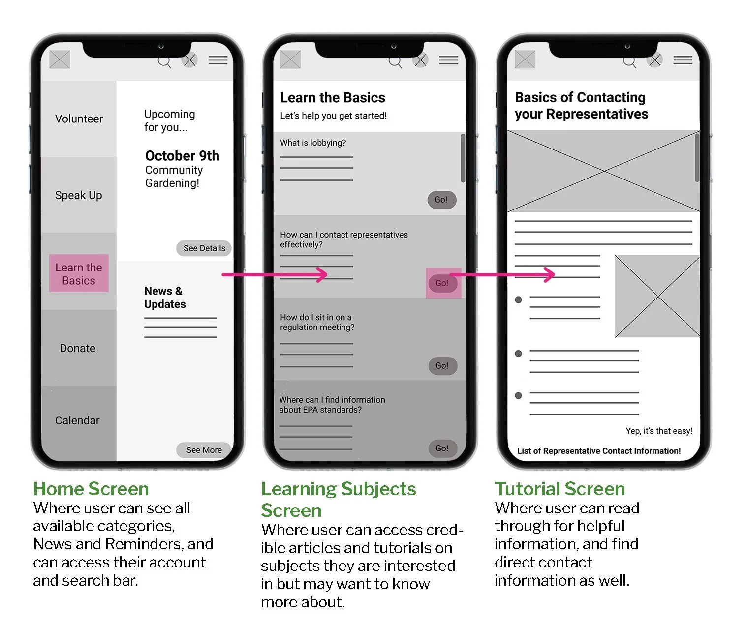
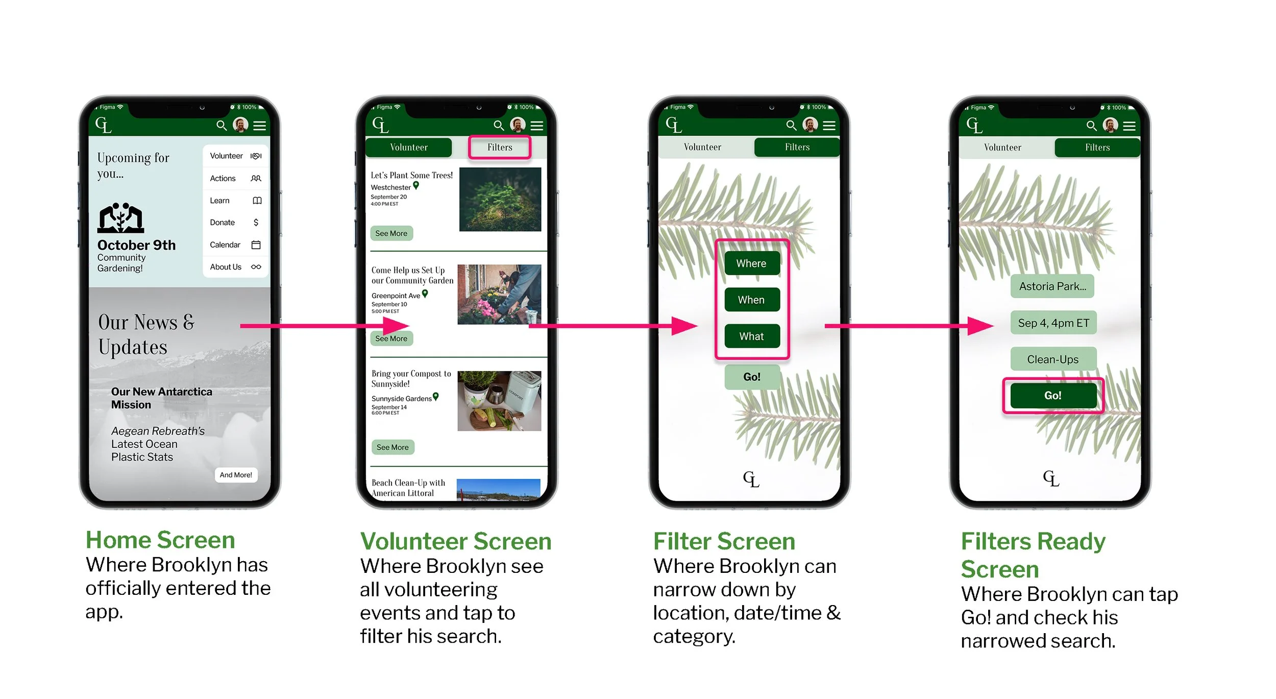
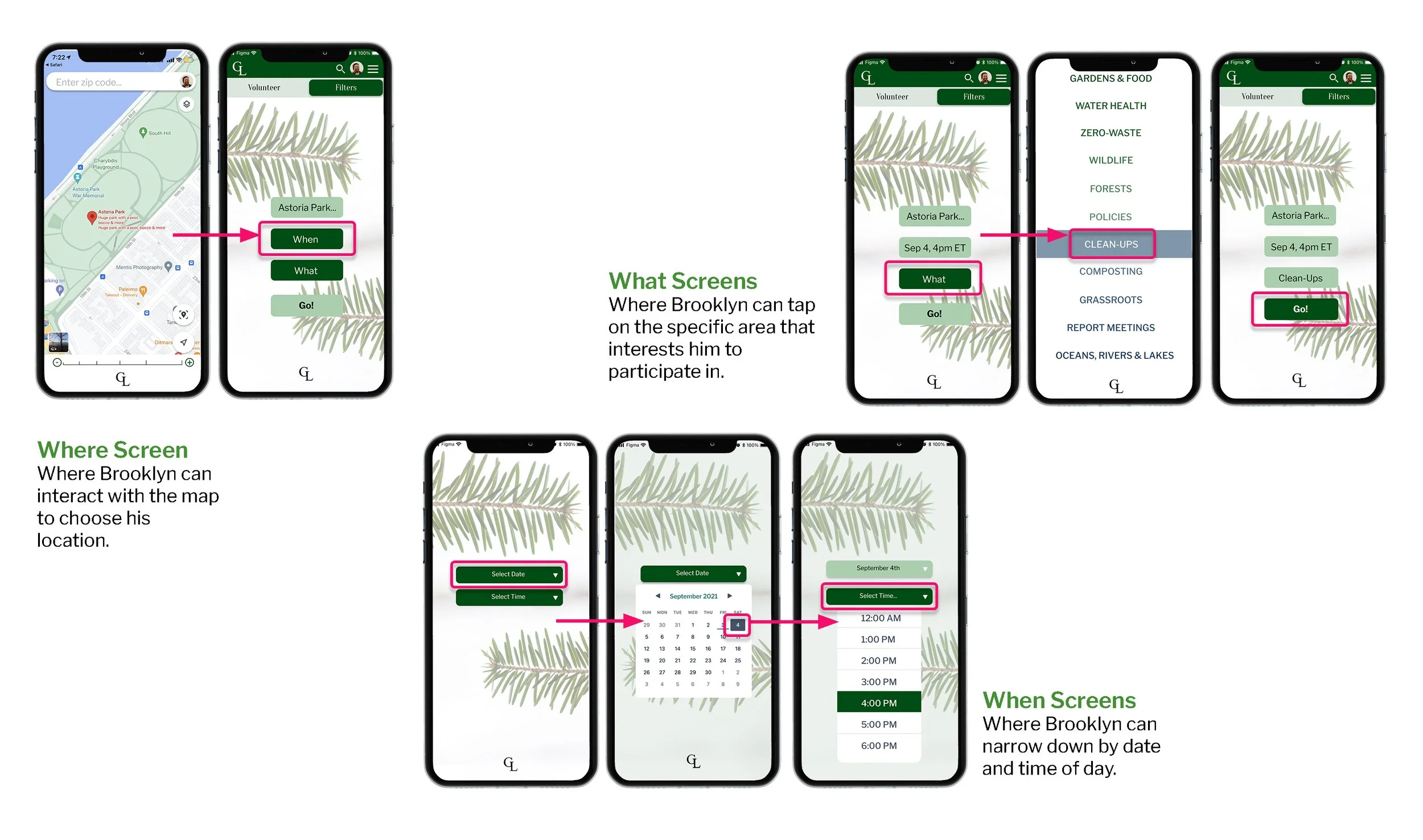
Let's walk you through the results and screen sequences below:
For a closer look into our design, you may also see our App Map on Miro.
Testing Again
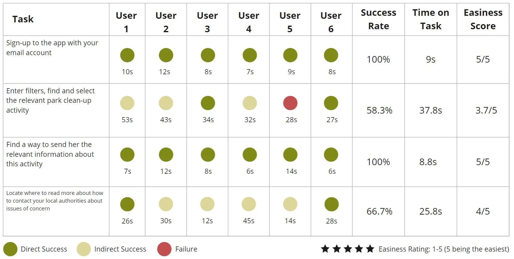
After testing one more time, we rounded up the measurable results (easiness ratings, time spent on task, and direct success rates) to compare with the first round and get precise statistics on what went better, and what did not. We also took note of feedback and behaviors again. Together, these things helped our team notice that:
Overall higher easiness ratings and direct success rates for the first three tasks prove that moving the filters within the action pages and making them accessible through a toggle at the top of the screen proved helpful.
The last task confused users the most. Lower easiness ratings and success rates and higher time on tasks revealed a need to revisit the information architecture and writing in order to make our platform more communicable and intuitive when it comes to seeking learning material.

Next Steps & Recommendations
Considering a Partnership
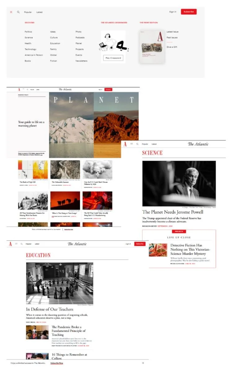
After careful consideration of our research findings and the values, we want to instill in our product our team considered the possibility of collaborating with The Atlantic, a print and digital news platform with sections on science and the environment. They are known for being credible, unbiased sources of information. With environmental/scientific slant. The Atlantic also has a large active audience and a history of brand partnerships.
How do we propose bringing value to this collaboration?
Making taking action accessible to all.
Additional credible resources and information.
Community and partnership growth and expansion.
Mutual Benefits:
Giving both of our readers/subscribers additional credible resources and insights into taking action.
Bringing individuals closer to each other: readers, scientists, journalists, organizations, and brand partners
Increasing a sense of community and camaraderie across different communities in different geographic areas—creating a movement towards environmental wellbeing.
Ways to Amplify the Partnership:
GreenLight aims to offer people credible resources to learn about causes and ways to influence on a political level (locally or nationally) from established experts. >> By partnering, the goal of offering credible, unbiased resources can reach a wider audience.
GreenLight offers individuals the ability to efficiently source ways to take action for the environment. >> By partnering with The Atlantic, GreenLight could provide its users with access to great journalism, and The Atlantic’s readers could be provided with ways to act on issues they read about.
Next Steps & Recs
After carefully observing the results, notes, and feedback from all the testing our team concluded that helpful next steps would include:
Creating our app for android users
Additional testing to better structure information architecture following task four insights
Meeting with our partner to implement a survey identifying the need for our product in the market
Potentially adding a chat feature to further engage community members
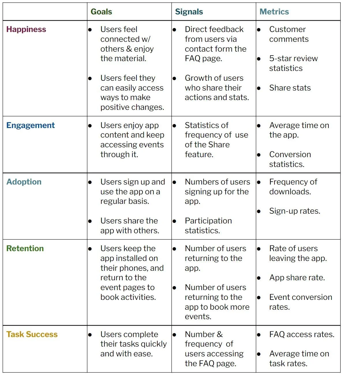
Additionally, after launch, our team intends to monitor the app's progress by tracking:
Examine how many people sign up and login
Analyzing the most clicked on features
Considering how long people use the application continually and the retention rate
Analyzing how many people use the share feature


